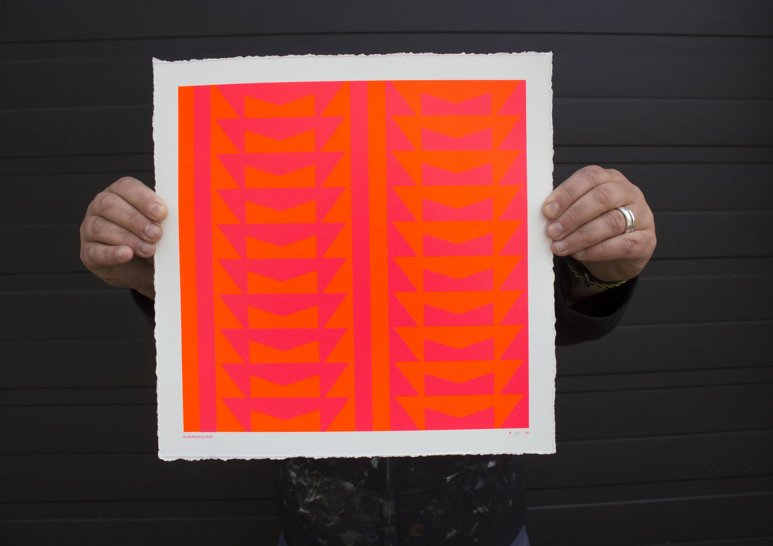
Behind the Screen Print : Scott Poulson
A work of neon madness! Scott Poulson describes himself as a:
“Designer and Artist – looking at the world around me – up and down, from side to side. Exploring the universe and the kitchen sink, in equal measure.”
This particular piece Poulson describes as:
“Everything in the universe is in motion: Illustrating ten full counterclockwise rotations of 360 degrees. Each rotation divided into ten, 36-degree increments. Repeated 10 times, giving 100 increments.”
A two Colour screen print hand pulled onto Mohawk Superfine 352gsm with a gloss varnish finish. 29.5 x 29.5 cm with a deckled edge.
This mathematical construction resulted in an extremely satisfying piece of graphic design which was a pleasure to print as a part of our Imprint series. Scott gave us a lot of freedom with the colour, and so we were able to experiment with our stock and pull the brightest combinations.
Printing one colour over the other meant the final product came out cleaner, this did however mean we had to test every variation of bottom and top colour to find out what affected the other least. We produced two final proofs, and upon Scott coming to the studio to decide which we decided they looked so good together that we would offer both.
Finally as a special touch, we spot gloss the prints. This is a transparent gloss coating that can be printed through the same screen printing mesh. We did however find when we printed the spot gloss, that the mesh size affected the overall finish.
This was some seriously subtle business but we couldn’t leave it at that, we are after all perfectionists. This led to us printing gloss on all our mesh counts to find the best result.
We look forward to seeing what Scott Poulson produces in the future, a true masterclass in design!
Pick up the print here: www.wellniceprints.com/print-shop/p/colour-rotations-by-scott-poulson
Check out Scott Poulson here: www.scottpoulson.co.uk


